Guindo Design
Strategic Digital Product Design
Design Systems for Digital Products
We create design systems that unify your visual identity, improve team efficiency, and deliver an accessible and consistent experience from day one.
What is a design system and why do you need one?
A design system is not just a component library. It’s the visual and functional expression of your brand. It defines how your product looks, behaves, and feels.
It helps align teams, reduce errors, speed up processes, and build a consistent, recognizable, and unique experience for your users.

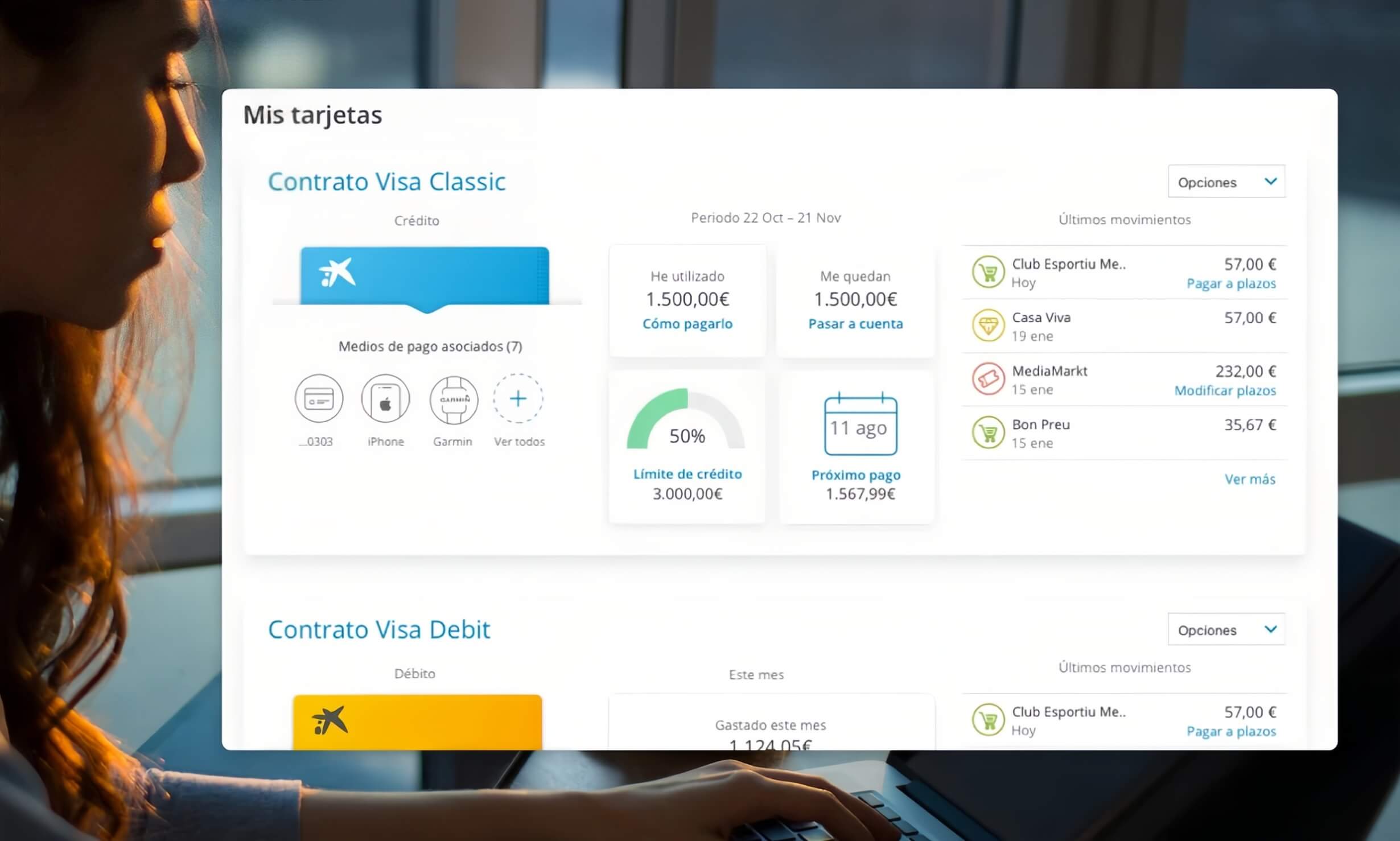
Documentation of the CaixaBank Now design system
Key benefits of a good design system
- Visual and technical consistency
Ensures a clear identity across all touchpoints. - Strengthens your brand
Each component communicates your company’s values and tone. - Unique user experience
Delivers a distinctive experience that sets your product apart. - Greater efficiency
Saves time and resources with reusable elements. - True scalability
The system evolves with your product without friction. - Integrated accessibility
Complies with European accessibility regulations (AA level) from the start. - Better collaboration
Creates a common language between design, development, and business.
Without a Design System…
You might face the following problems:
- Inconsistencies
Every screen looks and behaves differently, weakening your brand. - Duplicated efforts
Designers and developers reinvent the wheel in every new project or feature. - Team disconnection
Lack of a common language delays decisions and causes errors. - Fragmented user experiences
Users must relearn how to interact in each part of the product, losing trust and time. - Accessibility issues
Your product may exclude people with different abilities and fail to meet European accessibility regulations (AA level). - Slower and more expensive development processes
Product growth becomes chaotic, and every change requires reworking large parts of the system. - Difficulty scaling
Adding new features, teams, or products is complex without a solid common foundation.
Documentation we deliver
- Custom design system
Tailored to your product, brand, and needs (in Figma or similar). Not a generic template. - Library of reusable components
We document visual and functional elements such as buttons, fields, cards, etc. - Design tokens
Variables like colors, typography, spacing, and styles that ensure visual consistency. - Brand principles and values applied to the interface
We reflect your brand identity in component design. - Templates and interaction design patterns
Forms, navigation, listings, and more with usability and accessibility best practices. - Accessibility guide
Documented criteria from the start to meet European regulations (AA level or as needed). - Clear, visual, and collaborative documentation
For designers, developers, and other teams.
We adapt to your reality
- Startups and MVPs
Minimal but solid systems to grow with focus. - Medium-sized companies
Robust solutions for products with multiple teams. - Corporations
Complex architectures with governance processes.
Accessibility from the start
We apply European regulations (EN 301 549 - AA level) from the early design stages. This not only ensures legal compliance but also improves everyone's experience.
An accessible design is also clearer, more understandable, and more functional.
Our work process
- Audit of current design and brand
We analyze your product to identify inconsistencies and improvement opportunities. - Definition of identity and UX tone We define design principles and UX criteria with your team.
- System architecture and component creation We create a library of reusable components optimized for various devices.
- Documentation and delivery in Figma System delivered with visual, clear, and updateable documentation.
- Training and support for adoption Onboarding and training materials for using, scaling, and maintaining the system.
- Ongoing maintenance (optional) We support system growth with new patterns, updates, and continuous improvements.