← Blog from Guindo Design, Strategic Digital Product Design
Stairs, forms, slopes and stumbling blocks
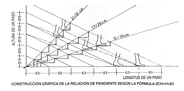
In the design of stairs (yes conventional stairs, the ones you go up and down every day in any building or in the underground), one of the fundamental principles is the pending, The tread depth (called the tread) and the tread height (called the riser) define the geometric relationship between the tread depth (called the tread depth) and the tread height (called the riser).
Stair slope

We all know how to go up and down stairs, that movement is implanted in the muscle memory The development of our legs begins in early childhood and is consolidated from the age of about 3 years old. But in each staircase we make a small adaptation of the cadence of ascent or descent. This cadence is defined by the slope of the stairs, which must be constant in order to maintain the rhythm and avoid falls.
I'm sure many of you have stumbled on a poorly balanced staircase or an uneven step due to wear and tear. When we face a staircase, let's say that the first step gives us all the necessary information to our legs about the cadence to follow. If this first “signal” coincides with the following ones, the staircase disappears from our attention: we climb up or down without thinking.. But if this cadence is altered or something doesn't fit, stumbling is assured.
A single step out of measure is enough to break the rhythm. Whatever the cause, the result is the same: the body stumbles, because the learned pattern is suddenly broken.
The forms are digital ladders

Redesign of a form.
When you face a form, you see a big staircase to climb. Few people enjoy climbing stairs. Any inconsistency (a field shorter than expected, a misplaced label, a misaligned button) breaks that cadence and forces the user to stop. That “stop along the way” is the digital equivalent of stumbling. On the web it doesn't hurt the ankle, but it does hurt the user experience: it generates confusion, frustration and, often, abandonment.
Let us think of concrete examples:
- A registration form that asks for too much personal data.
- A mandatory field that is not marked as such and returns an error at the end.
- A validation message that speaks in incomprehensible technical jargon.
- Or even a tabulation order that does not respect the natural logic of left to right, top to bottom.
Each of these details is an uneven step. The user may get over one, but what happens when the whole staircase is full of stumbling blocks? It just doesn't go up.
The right slope
Just as in architecture there are classic formulas for calculating the optimal footprint to riser ratio, in digital design there are principles that mark the correct slope of a form. Visual consistency, message clarity, friction reduction and accessibility are some of them.
A good form is recognisable because it flows:
- The user finds the logical order without thinking.
- The fields are the right size for the content they expect.
- Mistakes are pointed out in time and in simple words.
When everything is aligned, the user climbs the ladder without realising it.
In both architecture and digital design, true excellence is seen in the invisibility of the design. No one praises a staircase that simply does its job, but we all remember the one that tripped us up. The same goes for forms: the best are those that disappear, those that accompany without interrupting. Because in the end, whether in stone or pixels, that's what design is all about: building paths that the body (or the mind) can walk along without fear of falling.