← Blog from Guindo Design, Strategic Digital Product Design
Common mistakes when designing the first apps

In the more than 10 years that I have been teaching Interaction Design, I have seen patterns that are constantly repeated when design students are faced with their first project of conceptual definition of an app through wireframes or sketches.
In this article I will list, without claiming to be exhaustive, the most common challenges that students encounter when, after passing the research and architecture phases, they reach the modelling phase of the project. A particularly difficult phase for those who do not yet have sufficient visual organisational resources and find it difficult to translate their ideas into interactive screens and processes.
I have come across students with great discursive ability who, when they present their first sketches, look like beginners. And vice versa, students who did not excel in the research phase, but in the modelling phase have shown great ability to simplify structures, create user-friendly processes and build consistent visual systems.
If you are a student of Interaction Design, I hope this list will not only help us all to learn or remember these common problems, but also as a toolkit to face the definition of our first prototypes.
Homepages without a clear purpose
Problem
The homepage does not communicate the objective The main action of the project is not easily accessible. Some students turn it into a simple navigation, while others fill it with irrelevant news.
They also often prioritise links to social networks, which end up functioning as vanishing points rather than reinforcing the main experience of the app.
Solution
The home screen should be the functional focus of the application.. Always define what the key function of your app is and make sure that the user can understand and access it quickly and easily from the homepage.
Confusing or inconsistent navigation
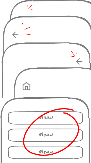
Problem
Opening the app and finding a home page that is little more than a directory of links creates confusion and can make the user not know where to start.
Other common mistakes include forcing the user to return to the home page to change sections, duplicating navigation unnecessarily or changing its structure throughout the project without a clear logic.
Solution
Navigation should be coherent, predictable and consistent. throughout the flow of the app. Presenting repeated content in the same order helps visual users orient themselves and remember where to find each option.
Criterion 3.2.3 Consistent navigation of the WCAG (Web Accessibility Guidelines)
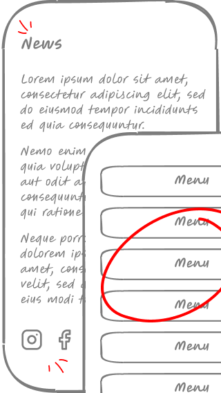
Lack of hierarchy in navigation and content
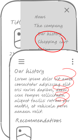
Problem
Hiding essential functions in inaccessible corners or presenting menus and content blocks without a clear structure.
This problem affects not only navigation, but also the organisation of content on a page. A bad example would be a home screen where the main block highlights corporate information such as «Our History» or «Company Values», instead of prioritising the essential functions of the application.
Solution
Group conceptually similar elements together and prioritise what is most important.
The distribution of content blocks should follow a clear logic.
Avoid relegating essential functions to inconspicuous positions and use familiar design patterns to facilitate navigation and user understanding.
Everything looks the same
Problem
If all elements have similar shapes (boxes, backgrounds or font sizes) applied to titles, buttons, paragraphs and lists, the user will not know what to do with them and how to differentiate their function.
Solution
A wireframe should communicate hierarchy and functionality.
Uses visual conventions to represent each element with its recognisable pattern.. Buttons should look like buttons, titles should stand out and listings should be easily identifiable.
Excess Lorem Ipsum
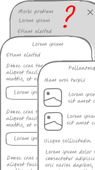
Problem
Using too much generic text in wireframes makes it difficult to understand the real structure of the information and the hierarchy of content. When all text is «Lorem Ipsum», it is difficult to understand what is being communicated, to assess what data is relevant and how it relates to each other.
Solution
It is not necessary to define the final content, but it is necessary to represent the typologies of information and their hierarchy.
In a product listing, for example, it is better to include sample names, prices and actual descriptions, even if they are tentative.
This helps to validate the design early and ensure that there is sufficient space for each type of content.
In addition, for developers, having a reference of the expected data facilitates the planning of technical requirements.
Lack of visual coherence between screens
Problem
Displays do not share coherent visual elements, This creates a sense of clutter and makes navigation difficult. This can manifest itself in abrupt changes in typography, button styles that vary between sections, or page structures that do not follow a common pattern.
This inconsistency forces the user to relearn the interface at each screen, generating confusion and increasing the cognitive load.
Solution
Define a global grid and page patterns that better structure the design.
Use a library of reusable components to maintain consistency in buttons, forms and typographic styles. In addition, establish clear style guides that include standard sizes, greyscale and margins to ensure visual cohesion throughout the application.
Visual consistency reduces complexity and facilitates user understanding, improving the overall experience..
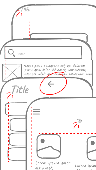
Lack of navigational guidance
Problem
Not including clear titles on each screen or highlighting the active section in the navigation causes disorientation for the user, making it difficult to navigate through the app. If a screen does not clearly indicate where the user is or what function it fulfils within the overall flow, the experience becomes confusing and unintuitive.
Solution
Each screen should have a visible and descriptive title to help contextualise the user.
In addition, in global navigation, the active section should be visually highlighted to provide a constant reference.
It is also advisable to reinforce this orientation by means of breadcrumbs, visual indicators in tabs or highlighting in the menu, ensuring that the user always knows where they are on the route and how to get back. to previous sections if needed.
Overly demanding interfaces
Problem
Forms with too many mandatory fields, use of unclear technical terminology and navigation processes that require too many steps, leading to user frustration.
It is also common to find interfaces that do not provide clear feedback when an error occurs, which may cause the user to abandon the task.
Solution
Design with accessibility and usability in mind.
Simplify forms by minimising mandatory fields and use clear and understandable language for all audiences.
Provide contextual help at each step, such as examples in the fields or informative messages to guide the user's action.
In addition, make sure that the interface provides immediate and understandable feedback in case of errors, facilitating correction without creating unnecessary friction.
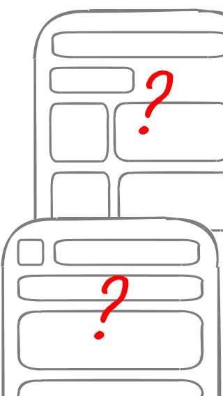
Generic, non-descriptive labels
Problem
Using vague terms in buttons, links, navigation labels or content block headlines can lead to confusion and make users hesitate before interacting with elements. Words such as «More», «View», «Details» or «Information» do not provide sufficient clarity about the action or content to which they lead.
It also occurs in navigation menus where options such as «Services» or «Resources» may be too broad and ambiguous, making it difficult for the user to find their way around.
Solution
Use descriptive and action-oriented labels. Instead of «View», use «View order details»; instead of «More», specify «Read more about this event». In navigation menus, opt for more specific terms, such as «Personalised advice» instead of «Services», or «Guides and tutorials» instead of «Resources».
This improves immediate comprehension and avoids ambiguity, ensuring that the user is clear about what will happen before clicking.
Legibility problems
Problem
Text that is too small or with low contrast, making it difficult to read, especially on mobile screens or for people with low vision.
Solution
Ensure sufficient contrast between text and background., avoiding low-contrast colour combinations that make reading difficult.
Use legible fonts in an appropriate size, ensuring that text is accessible on different devices and resolutions.
Correct spacing between lines and paragraphs is also essential to improve reading flow.
In addition, it is advisable to avoid long blocks of text without visual separation and to use alignments that favour legibility, especially on mobile devices.
Fear of scrolling
Problem
Design as if the screen were a fixed canvas, allowing no vertical scrolling and forcing all content into a single block.
Solution
Users are used to scrolling. Use vertical space when necessary to better structure information without cluttering the interface.
Wireframes too detailed
Problem
Adding colours, typography, illustrations and other visual details at a stage when the structure and functionality are still being defined.
Solution
Keep wireframes simple and focused on information hierarchy and navigation flow. This facilitates rapid iterations and conversations focused on the user experience.
Learning from mistakes
Learning in interaction design is progressive and based on experimentation. Making mistakes is part of the process, but the important thing is to detect, understand and correct them.
If you've identified with any of these points, don't worry: we've all been there. The key is to refine each iteration and keep learning, so take heart and design without fear!