← Blog from Guindo Design, Strategic Digital Product Design
Affordance and flat design: what Gmail lost in its redesign
One of the most criticised aspects of the recent redesign of Gmail, and Google's applications in general, on Twitter is the appearance of the buttons. In addition to eliminating labels and relying solely on icons, the design is completely flat.
Overall, the new look & feel conveys an overly flat, monochrome appearance, with little contrast and few visual clues as to which elements are clickable and which are not.

One of the main arguments for this redesign is the search for cleanliness and modernity. While it is true that the interface is more refined, it is also true that the desire for diaphanousness has eliminated clear visual focal points, and the “brush” of modernity has taken the affordance of many elements.
This is where the concept of affordance. By definition, a affordance is the quality of an object that gives us clues about how it is used. In the case of buttons, it is their pushable appearance: the small design nuances that indicate that they protrude from the surface and can sink when clicked.
The interesting thing is that you don't need to make big changes to get those tracks back. Small design tweaks can make all the difference.
Let us take the current design as a basis:
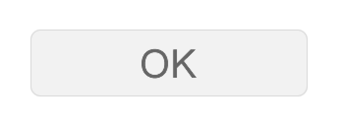
The current design is simple and elegant, but has a problem: visually it could be interpreted as both a button and a text box.
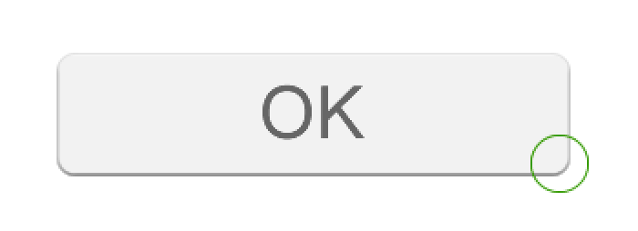
To make its function more explicit, we can raise it slightly, as if it were protruding from the surface of the interface.
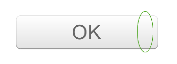
Now the button is not so flat, there is a small rise in the central area that invites us to press it. Even so, it can be further enhanced.
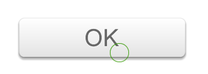
With just these three modifications, the button already feels much more clickable, without losing colour consistency or overall style. Similarly, the contrast between read and unread messages, or the differentiation between groups of messages, could also be improved.
We may have sacrificed some modernity in this exercise, but we must remember that we use these applications intensively every day. Ergonomics, accessibility and the psychology of perception are as important as aesthetics. After all, fashions are fleeting, but usability remains.